Annotation Glossary for the Design to Code Plugin
Annotations are labels you attach to layers in your Figma design so the plugin knows what each layer is — a button, a checkbox, a text field, a table row, and so on. The plugin uses these labels to turn your design into working code, so the better the annotations, the better the generated app.
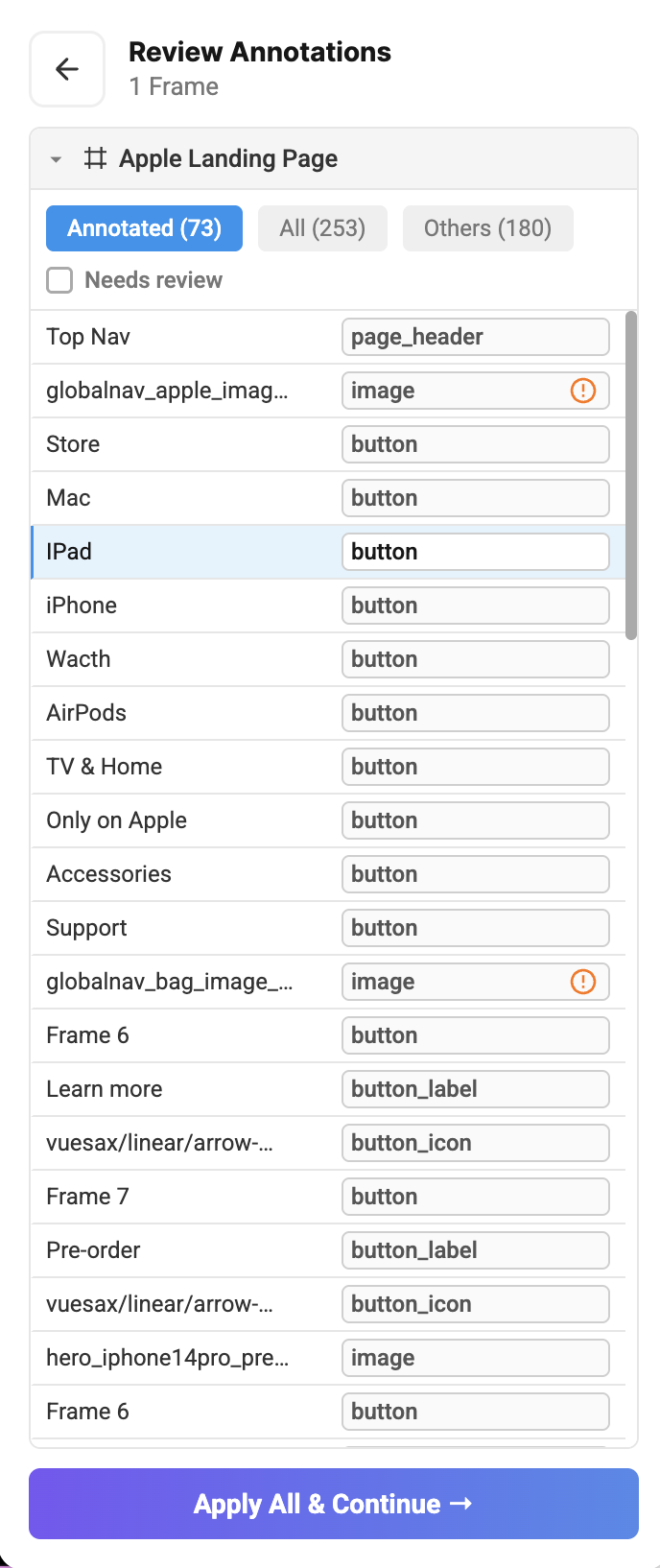
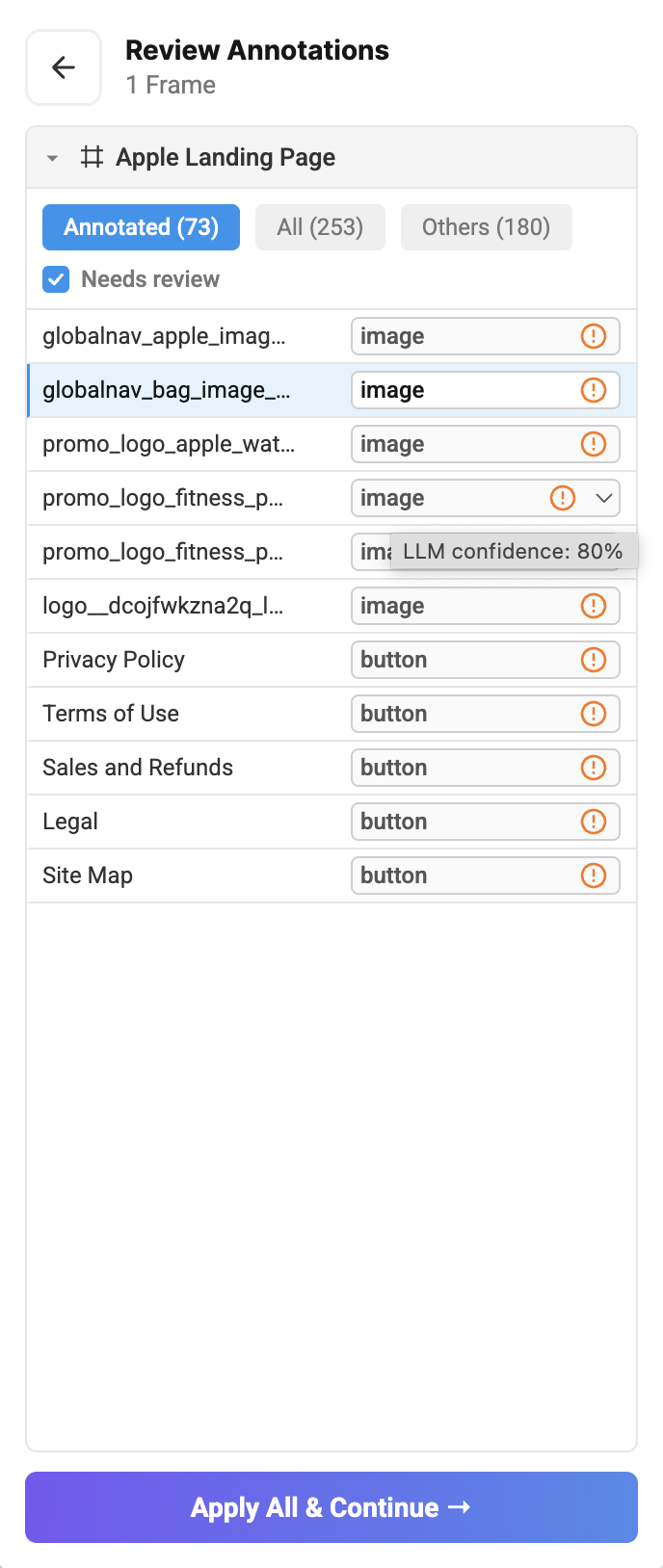
You don't have to annotate everything by hand. When you run the plugin, an AI model reads your design and applies annotations for you as a first pass. Your job is to review its work — check each label, correct anything that looks wrong, and fill in anything it missed. This guide is your reference for that review: use it to confirm the AI picked the right label for each element, and to look up the correct label when you need to make a change.
The Review Annotations panel lists every layer alongside the label the AI assigned. Check Needs review to filter down to layers the AI flagged as low-confidence:
You don't need to know anything about code to use this guide. For each element on your screen, look through the list below, find the one that visually matches, and apply that annotation to the smallest layer that fully covers the element. If something on your design doesn't clearly match anything here, it's fine to skip it — un-annotated layers are just treated as plain containers.
A quick rule of thumb: annotate by what the component is, not by what the layer is called in Figma. A layer might be named "Card 3" but actually be a checkbox — it should still be annotated as Checkbox.
Contents
Inputs & Controls
Button
A clickable action element. Includes labelled buttons AND icon-only buttons.
- Tag the outer clickable frame.
- Bare text link with no wrapper frame (header/footer link) — tag the TEXT node itself. No Button label child needed.
- Bare icon with no wrapper frame (standalone icon-only button) — tag the icon node itself. No Button icon child needed.
- Never a raster image inside. If the visual is a photo/illustration, it's not a button — leave it or tag as Image.
- At most one text node. Two texts (title + subtitle) means it's not a button — probably a card.
Children to tag inside:
| Child | When |
|---|---|
| Button label | TEXT — the button's caption. Skip for icon-only buttons. |
| Button icon | Vector icon inside the button. |
Checkbox
- Annotate every visible checkbox — including "unchecked" states.
| Child | Required | What |
|---|---|---|
| Checkbox label | Yes | TEXT beside the box. |
| Checkbox control | Yes | The checkbox control — the square area (with or without a tick). |
| Checkbox icon | No | The tick glyph, if it's a separate node inside the plate. |
Toggle
- Tag only the pill control, not a wider row that pairs it with a label.
- The label beside a toggle is free-floating text — leave it un-annotated.
| Child | When |
|---|---|
| Toggle icon | Optional icon inside the thumb. |
Text field
Single- or multi-line text input.
- Tag the outer wrapper frame that visually bundles the input box together with its label and any supporting text — the whole text-field component. If there is no wrapper and the input box is standalone, tag the input box frame itself.
| Child | Required | What |
|---|---|---|
| Text field input | Yes | The FRAME that visually is the input box. |
| Top label | No | Text ABOVE the input, as a separate element. |
| Floating label | No | Text sitting ON/INSIDE the border. |
| Text field placeholder | No | Hint / current value text inside the box (TEXT only). |
| Helper text | No | Helper text below the input (TEXT only). |
| Text field icon | No | Leading or trailing icon in or beside the input. |
Dropdown
Select / combobox. Only tag as Dropdown if a chevron icon is visible. No chevron — tag as Text field instead.
| Child | What |
|---|---|
| Dropdown input | The FRAME that visually is the input box. |
| Dropdown label (top) | Label ABOVE the input. |
| Dropdown label (floating) | Label inside/overlapping the input. |
| Dropdown placeholder | "Select…" hint inside the box. |
Date picker
Text field with a calendar affordance.
| Child | What |
|---|---|
| Date picker label | The floating label. |
| Date picker input | The input box FRAME. |
Search
Text input prefixed with a magnifying-glass icon.
| Child | What |
|---|---|
| Search placeholder | Placeholder text inside. |
Radio group
Group of radio circles where exactly one is selected. Each option is just a circle + one label.
- If options look like cards (border, fill, shadow, extra text), it's not a Radio group — use Card list instead.
| Child | Required | What |
|---|---|---|
| Radio item | Yes | Every unselected option (frame with circle + label). |
| Radio item (selected) | No | The one selected option. |
| Radio circle | Yes | The visible ○ / ● circle inside an item. |
| Radio label | Yes | The TEXT label inside an item. |
Slider
Track with one or two draggable thumbs. No children to annotate.
Progress bar
A horizontal filled bar showing percent (loading, progress). Not for stepper tracks or numbered steps.
Segmented button
Horizontally joined toggle segments acting as a single picker (like a filter chip strip).
- Use for tab-shaped wizards / steppers — a strip of tab-like steps that progress through a flow.
- Use for tab strips whose header row has non-tab siblings — e.g. the strip sits alongside a page title, action buttons, or search inside the same frame (not just a content pane).
- If the strip is a pure tab bar with only a content pane as its sibling, use Tab instead.
| Child | Required | What |
|---|---|---|
| Segment item | Yes | Every unselected segment. |
| Segment item (selected) | No | The selected segment (exactly one). |
| Segment label | No | TEXT inside a segment (add on all segments if using labels). |
| Segment icon | No | Icon inside a segment (add on all segments if using icons). |
Navigation
Page header (web)
The top strip of the page containing logo/title + nav + actions/avatar.
- Exactly one per section.
- After tagging the header, keep annotating buttons, search, avatar, etc. inside it — treat the interior as normal.
Tab (web)
Horizontal strip of tab headers where one is active.
- Tag the narrow strip-only frame.
- Never tag a frame that wraps both the tab strip AND the content area below.
- If the strip sits inside a header alongside a title or action button (no content frame as its sibling), use Segmented button instead.
| Child | Required | What |
|---|---|---|
| Tab item | Yes | Every unselected tab. |
| Tab item (selected) | No | The active tab (exactly one). |
| Tab label | No | Tab caption TEXT. |
| Tab icon | No | Icon inside a tab. |
Tab content pane (web)
The pane content shown below the tab strip. Tag the outermost container that holds all the pane content, even if it contains other tagged widgets inside.
Bottom nav (mobile)
Mobile bottom bar — persistent strip of icon/label tabs at the bottom.
| Child | Required | What |
|---|---|---|
| Bottom nav item | Yes | Every unselected tab cell. |
| Bottom nav item (selected) | No | The active tab cell. |
| Bottom nav item label | No | Tab TEXT. |
| Bottom nav item icon | No | Tab icon. |
Bottom nav wrapper (mobile)
The outer FRAME around a Bottom nav that gives it its floating look (extra padding, rounded outer corners, shadow).
Required for floating bottom bars. If the Bottom nav visually floats above the content — rounded corners, drop shadow, side insets — you must annotate this wrapper. Without it, the bar renders flush against the screen edges and loses the floating appearance.
Skip only when the bar sits fully flush with the screen edges (no wrapper, no insets, no shadow).
Left nav (rail) (web)
Narrow vertical nav — icons stacked above labels, everything center-aligned.
Left nav (drawer) (web)
Wide vertical nav — icons beside labels, items left-aligned.
Both share children:
| Child | Required | What |
|---|---|---|
| Nav item | Yes | Every unselected nav entry. |
| Nav item (selected) | No | The active nav entry. |
| Nav item label | No | TEXT inside an item. |
| Nav item icon | No | Icon inside an item. |
| Nav logo | No | Brand logo at the top. |
| Nav button | No | Standalone action button inside the nav. |
| Nav button label / icon | No | Its label / icon. |
Breadcrumb (web)
Chain of clickable path segments joined by >, /, or arrows.
| Child | What |
|---|---|
| Breadcrumb item | Container for one crumb. |
| Breadcrumb label | TEXT inside a crumb. |
| Breadcrumb icon | Icon inside a crumb. |
Layout & Content
Data table (web)
A grid: header row + data rows + optional pagination/search.
When to tag the root frame as Data table: only when that frame's children are just the header, rows, and optional pagination/search. If the frame also holds a detail panel, edit form, empty-state art, action bar, or ANY other content, don't tag the root — annotate only the inner nodes below and the tooling assembles the table from them.
| Child | Repeats | What |
|---|---|---|
| Table column header | Yes | Each column header cell. Tag the frame OR a bare TEXT header. Skip checkbox headers. |
| Table select-all header | No | The "select all" header cell (top-left, if present). |
| Table row | Yes | Each data row frame. |
| Table cell | Yes | Every plain text data cell. If it's an avatar+text cell, ALSO tag the avatar inside as Table cell avatar (first row only). |
| Table cell avatar | No | Avatar image inside an avatar+label cell — first row only. |
| Table cell (badge) | Yes | Cell containing a colored badge/chip. Use instead of Table cell. |
| Table cell (button) | Yes | Cell containing an action button. Use instead of Table cell. |
| Table cell (toggle) | Yes | Cell containing a toggle. Use instead of Table cell. |
| Table pagination | No | The pagination control frame. |
Wrap the header row and data rows in a single, meaningfully named parent frame (e.g. "Data Table") instead of leaving them as loose siblings. See Semantic Grouping in the design guidelines for why this matters.
List
Vertical list — items stacked top-to-bottom.
- Tag the outer wrapper frame that contains all the items. Every direct child frame is treated as one repeating item automatically — no per-item annotation needed.
- Use when the wrapper has 3+ equal-width child frames stacked vertically.
Group the repeating item frames under one meaningfully named parent frame rather than leaving them as loose siblings. See Semantic Grouping in the design guidelines for why this matters.
Card list
Horizontal / grid list — items laid out left-to-right, may wrap.
- Tag the outer wrapper frame that contains all the cards. Every direct child frame is treated as one repeating card automatically — no per-card annotation needed.
- Use when the wrapper has 2+ equal-height child frames arranged horizontally or in a grid.
Group the repeating card frames under one meaningfully named parent frame rather than leaving them as loose siblings. See Semantic Grouping in the design guidelines for why this matters.
Form
Container grouping input widgets (Text field, Dropdown, etc.). No children — the inner widgets are annotated independently.
Media & Misc
Icon
Standalone icon glyph (vector shapes).
- Tag the smallest frame/group/instance that contains all vectors of the glyph.
- Never tag an individual vector when it has vector siblings that are part of the same glyph.
Image
Standalone raster/bitmap image (photo, illustration).
- Use when the node is visibly a photo or lossy bitmap, not a clean vector glyph. Use for hero sections also.
Avatar
User avatar — a circular frame containing at most a monogram or icon.
- Tag the smallest circular avatar disc.
- Never tag a wider "user chip" that includes the name TEXT.
| Child | What |
|---|---|
| Avatar text | Single monogram TEXT inside the disc. |
| Avatar icon | Icon inside the disc. |
Divider
Thin horizontal or vertical rule separating content. No children.
Common mistakes
- Tagging a card as Button — a card has multiple text nodes (title + description). Only tag as Button if there's one text (or none, for icon-only).
- Tagging a container that includes extra content — e.g., annotating the whole Data table / List / Tab wrapper when it also has a header, action bar, or unrelated frames alongside. Tag only the inner nodes in that case.
- Tagging a user chip as Avatar — Avatar is only the circular avatar disc. The name beside it stays un-annotated.
- Tagging a bitmap as Icon or Button icon — those are for vectors only. Photos/illustrations go under Image.
- Skipping some checkboxes / text fields — always tag EVERY visible instance of the same widget type on screen. Don't tag one and skip another.
- Confusing Tab with Segmented button — if the strip has a large content pane as a sibling below/beside it, it's Tab. If it's a compact filter strip inside a header with no content pane, it's Segmented button.
- Missing Text field input — the input box FRAME is mandatory on every Text field. Never tag a TEXT node as Text field input.